December 26, 2012
One of the commonly asked questions that I have been getting this month is, “What is the difference between a lustre and linen print” and/or “What is the difference between a metallic / pearl finsih vs. a lustre finish?” Well! I am here to answer that question! The hardest thing for me lately has been how I describe the difference between these. Normally I bring a ton of samples to my consultations, so my clients can see these images first hand. However, since the holidays can be a very busy time for most families, they just don’t have time for the in-person consultation and just want to chat over the phone, which is totally understandable. Since this subject can be hard to describe, the best thing is to show you examples. :) If you’re in the Orange County, CA area and are looking to add some art work to your home of your session, we will show you the difference between these in person, when you schedule your consultation, and again at your premiere. Below you will see a Lustre Print, a Linen Print and a Metallic/Pearl print and the differences between each one. Please note that I did not take these exact images, these are just samples that I received from one of the professional printing labs.

The image above has a Lustre Finish. This is the most commonly ordered print. Up close you can see the slightly rough surface. This does not take away from the photograph, nor can you see it from the normal viewing distance, the only time anyone really notices this is when they are up close.

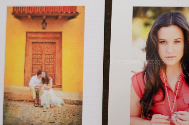
The image listed above on the left has a linen texture, and the image to the right as a Metallic Finish. The Linen finish is great as an added texture. is type of finish is great for landscape images. Every now and then a client will order the Metallic finish for their portraits though. It is all on preference! As you can see, the Metallic Finish is smooth, glossy and has a dash of shine to it.

This image, the one above, is the Linen Finish. This finish is not for everyone, however it is the second most popular Print Finish next to the Lustre. The Linen Finish has more of a texture to it. Some of my clients ask if those lines/texture take away from the image. It doesn’t. When your photographs are displayed, you actually can’t really tell. Not until you are holding it up close. I feel like the Linen Finish adds a unique edge to the photograph as a whole, and adds a nice solid, unique take on the image, making even more artistic.

Above I displayed the Linen Finish and the Metallic/Pearl Finish side by side.

The above image is Linen. From this angle you can’t see the texture. Once you get closer to the image the texture become more visible adding a little extra volume and artistry to the image.
For the final image I wanted to be sure to get all three Finishes in. This was take at a further distance. You can barely see the textures or the smoothness in the images, hopefully this helps you with how your images will look at a distance as well. Please also keep in mind that prints are automatically ordered on Lustre Paper with the Lustre Finish only but you, of course can choose what works for you when you schedule your session. (: Photographers: We’ve been getting a lot of questions from other photographers regarding this topic. To receive updates on this topic and similar ones in the future, subscribe to our photographer newsletter here. If you have any other questions be sure to send me an e-mail:: Brittney@KincannonPhotography.com Sincerely, Brittney Kincannon


facebook
instagram
contact
Stay in Touch: